Branding | webpage design | app design
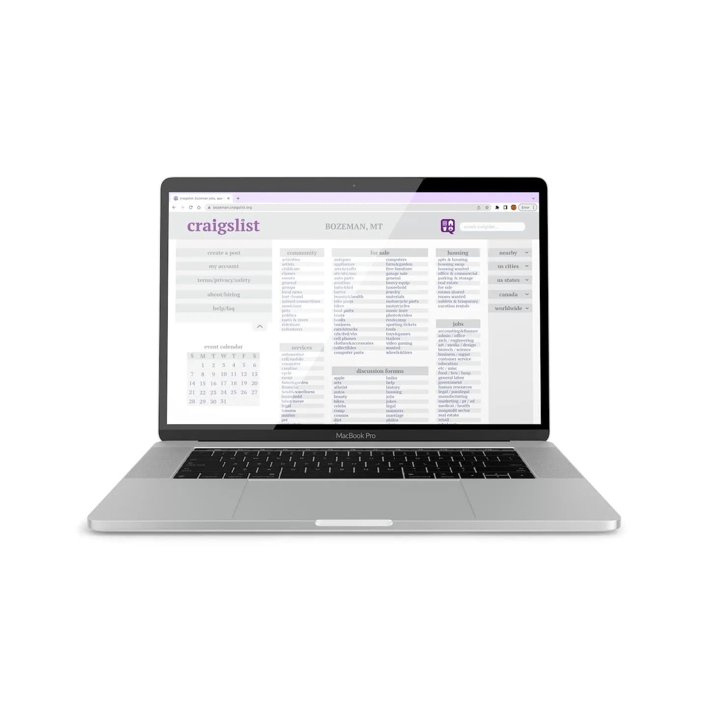
Craigslist, an online platform for community connection, buying and selling, job opportunities, and more, is well known for it's bare bones branding and website. To bring it into modern times I redesigned the Craigslist branding, website, and app in my Identity Systems class.

The Branding
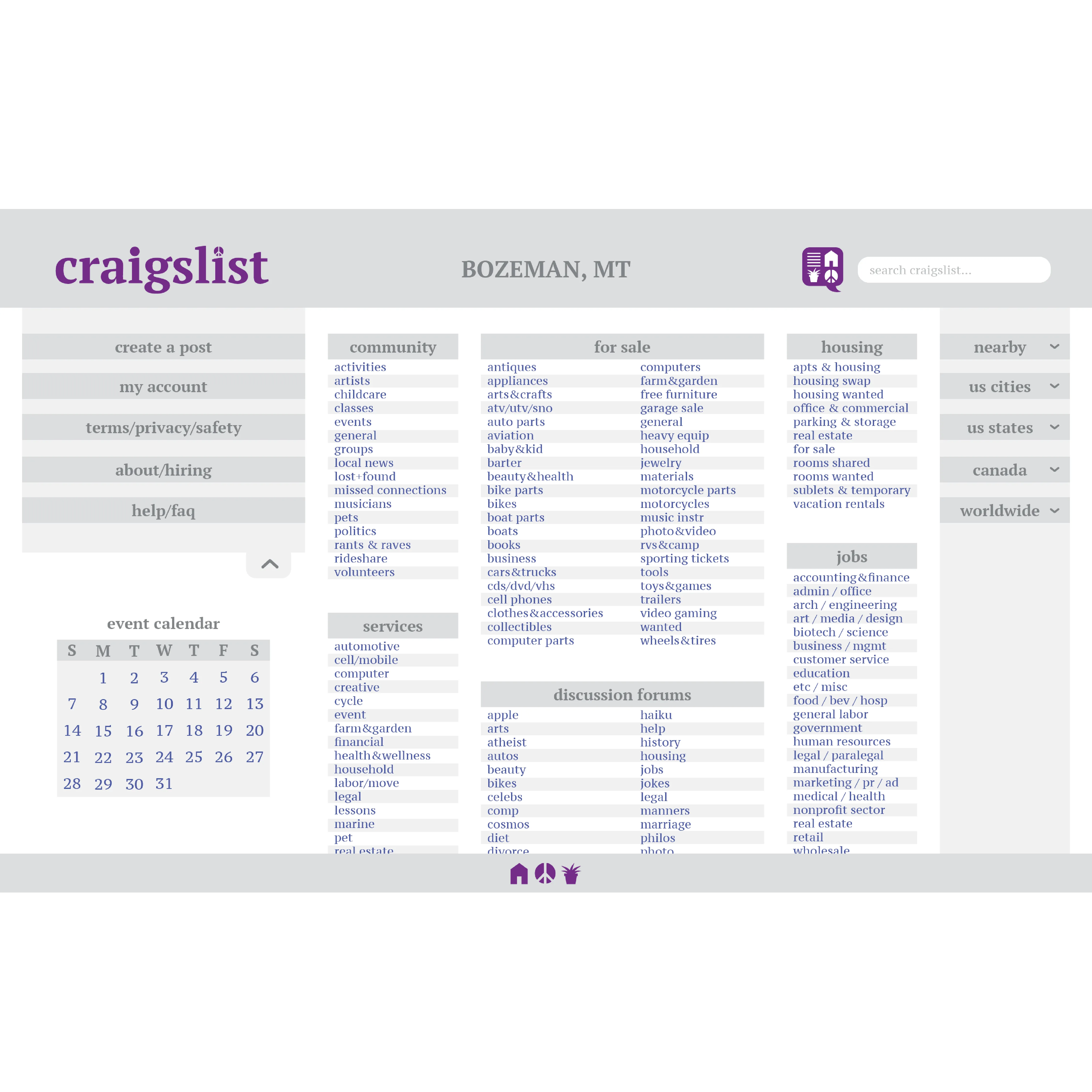
The current Craigslist logo has been the same since 1995. This makes the logo very iconic, however it also is incredibly dated and bland. I sought to maintain the serifed text and peace sign, but with a more bold approach. The peace sign is incorporated into the wordmark and the text is slightly heavier to reflect modern logo design. I also designed a decorative icon that reflects the main uses and values of the platform.
The Website
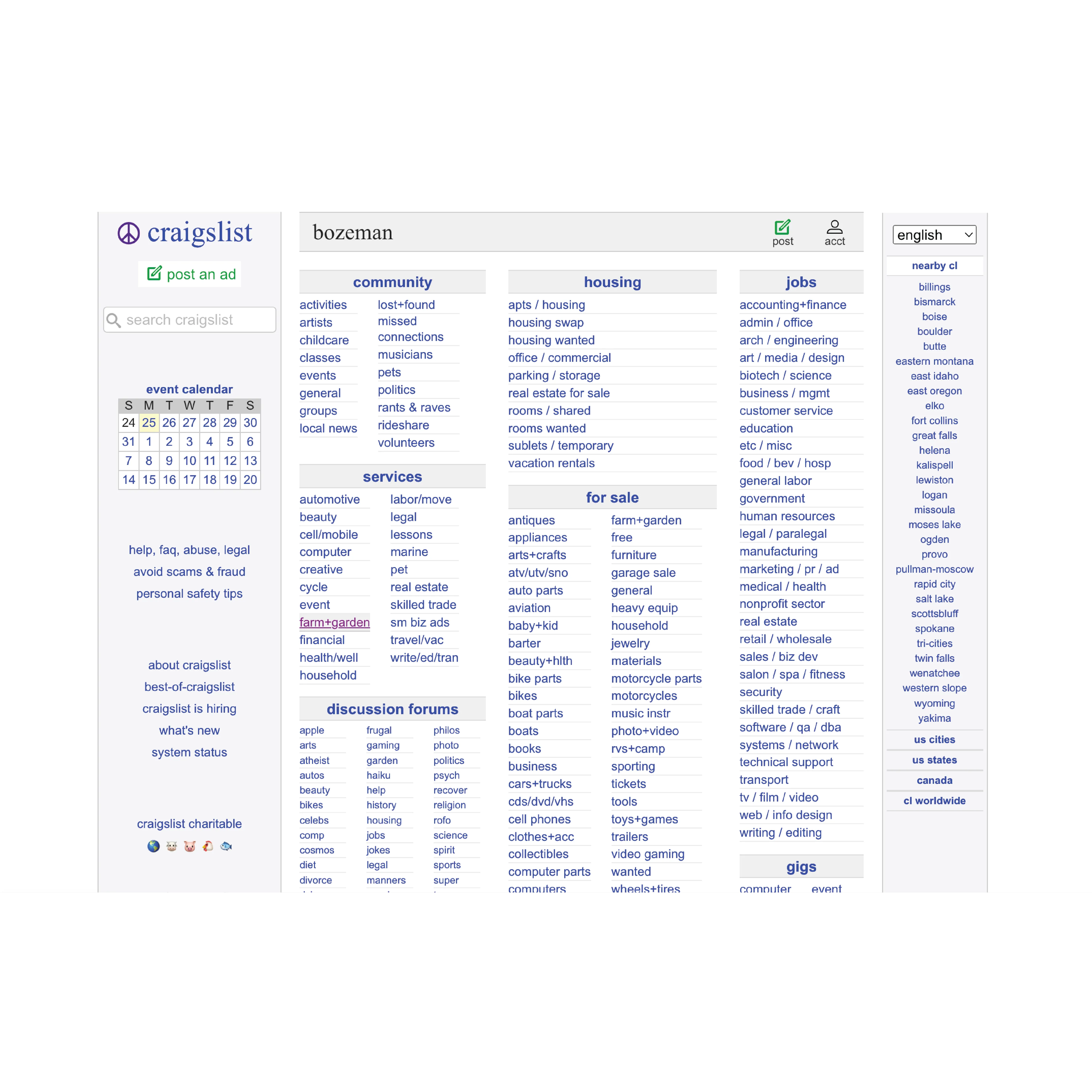
The current Craigslist website has very little hierarchy and has an overwhelming amount of text. I do believe, though, that its lack of design has a certain charm to it and it's bare bones nature makes it so the listings are the most important part, rather than the design itself. To continue this theme, I kept the website primarily grey and blue but increased the hierarchy and added drop downs so not all of the content is visible at once. I also arranged the content in the side bars in a more logical way. Keeping the content the same avoids confusion from long time users, but displaying it in a more streamlined way keeps the website with the times.

The App
Like the website, the Craigslist app is lackluster. I again kept the content generally the same, and just revamped the typography, colors, and icons to match with the rebrand.


